Sunday 25 November 2012

Object Concept Progress

As with my creature, this post shows my progress for the creation of a digital concept of my refined image, but this time for an object which in my case isa space craft.


I decided to use the same tracing technique i had used for my creature piece for this image, but i had only reached the point you see in the image above before i decided to take a new approach.


Given the relatively simple appearance of my refined image i believed i could get away with the use of circles sized and shaped to match my image.


Above you can see an image that better portrays what i was trying to do, i made use of a single perspective line to correctly proportion the crafts outline as well as the rings.


When i was happy with the lines i decided to try using the gradient tool to give the ring a convincing 3d appearance. Through crafty use of the selection tool which allowed me to only create the gradient where i wanted it to be, i believe i managed to pull this off quite well.


I then went on to use the circle outline to add some detail to the ship. I used the brush tool to create the lines you can see extending between the rings.


Here's a close up of some finer detail i added.


The final part of the line work was to erase parts that needn't be there.


As you can see, a lot changed between screenshots here. I started by adding the dark background, and moved on to adding some colour and shading to the ship using the gradient tool and some brush work. Finally, I went over this colour base with a square brush to create the slightly more interesting appearance for the ship.


I felt the ship needed to be more interesting in appearance, so i used goodle to find the circular pattern you see above. After taking it into Photoshop i used the 'Colour Range' selection tool to remove the white from the image, and then used the 'Expand' option to make the lines thinner.


I then pasted the refined pattern in to my main image and manipulated it into place, reducing the opacity to make it blend in better.


I then decided to add some texture to the ring, i again used google to find a suitable image, before taking it into Photoshop. In this case, it was necessary to duplicate the image vertically to streamline the process, though i felt no need to blend the images together. I even ignored the watermark in the corner of the original image.


 After moving the image across, i then made use of the very useful 'Warp' tool to stretch the image into place.


As you can see in this image i had a change of heart about placing the warped image on the outside of the ring, i decided it was more fitting on the inside of the ring.


 The next thing i did was add some shading to the ring using the simple gradient shown above.


Here's the result, i believe its a great improvement.


After this, and being satisfied with the shading (minus the black windows i added between shots), i proceeded to start experimenting with the colour, settling for a faint green on the space ship and a dark, steely blue for the ring. To achieve this i simply colourised the layers on which each object was located and then messed around with the colours til i had something i was happy with.


 Finally, i borrowed a space image i found on google to use as my background, then used the same technique of colourisation to find something that complemented the colours already in the picture.


After this i moved on to the final details which included the beams that are firing from the spaceship which i made simply using some careful brush work, and minor details like the tiny red lights, the glint on the window and the blue thrusters.

Below is my final, object concept piece in all it's glory:


I am very happy with this final piece, i believe it shows a far more polished final outcome than my creature concept, even though i used much simpler, refined techniques to create it. I also believe that with more time it could look even better, but then this is only supposed to be a concept image. If i were to change anything it would most likely be the beams as i feel my original concept portrayed more of an arcing bolt of electricity activating the warp drive. I also feel that this image doesnt demonstrate an obvious sense of scale to it, i believe this can be attributed to the very focussed, centralised nature of my image, had i used a different layout i believe i could have resolved this particular problem.

Thursday 22 November 2012

Session 8 - 19/11/12

Today our first task was to use the website 'Pimp my Gun' to create our own firearm designs and take one into photoshop.

Pimp my Gun is a website with a library of different firearm components that you can throw together as you choose. This technique, known as 'collaging' according to our lecturer, is a great process for generating ideas, it allows the user to brainstorm without much thought, in the hopes that you will create something you like, or something that gives an artist the creative spark they need to start working. Below you can see a few of my designs, they vary from the realistic-yet-different, to the futuristic and bizarre.


This website is a lot of fun, and allows a lot creative freedom, and after using it for a while we were asked to take one of these designs into photoshop and create a concept image with it.


As you can see, although i took the futuristic design, not much has been changed. I narrowed the gun itself and added some structures that might hold it together, but overall i really like the aesthetic it already had, it seems like a cop-out i know but that's just how i felt, i also thought that something you dont see in weapons is vertical symmetry, thats why i find this design fairly refreshing, even though assymetry is a design choice to allow some functionality to the device...

In the next part of the lesson we were introduce to our next task which, put simply, was to repeat exactly the same process we had used to design our character/creatures, but to instead design an object.

So to start off, i went in search of inspiration.


And after scouring turtleart.net for some time, here it is. This image is, as far as i can tell, a rendered 3d model of a Lightcycle from the movie Tron: Legacy. It was designed and created by Daniel Simon, a concept designer who specialises in vehicular design, holding senior designer positions for both Bugatti and Volkswagen, before he moved to designing for hollywood films and his own personal projects.


Above you can see some concept work for my chosen image, i really enjoy the blend of angular and curved surfaces that were used in this design and i hope to be able to capture it in my own work.

As was done for the character design, i started with a page of credit card concepts:


As you can see i tried to mimick Simon's curvey approach in my work here, and it was this that led me to my final idea on the bottom right, which everyone in my peer group agreed was the best design. Just from looking at it you might be wondering why, and thats because the tiny concept image gives nothing away. The idea came about when thinking of curves, and was that of a spaceship with a warp drive, you can see why HERE. Basically, its a spaceship with a ring around it. You can get a slightly better idea of it from my refined image, which you can see below:


If you clicked through to the article i linked, you'll see the similarities between my design and that of the hypothetical warp drive craft. I make the assumption in my design that the ring would need to be spun for the drive to function, hence the small dots on the bottom of the ring, which are thrusters, there are more on the top. 
There was another article on this theoretical warp drive that posed the idea that using such a device would cause 'shockwaves', much like soundwaves build up on jets as they travel, causing a devastating beam of energy when the drive reached its destination (see HERE.) In a most likely laughable solution to this problem, i decided to make the craft a very flat, razor sharp flying saucer. The reason being that the low profile of the craft would mean that no significant energy buildup would happen. I thought of the idea that these saucers could turn on their side (though orientation doesnt really have a place in space to be honest) when entering one of these rings, and that their engines, located in the centre of the craft, could be used to power them. The jagged lines are supposed to be arcs of electricity, either acting as an ignition for the drive, or providing a constant stream of electricity, i havent decided yet.

After this stage, it was once again time to get my refined image into Photoshop. See my next post for how that went.

Monday 12 November 2012

Session 7 - 12/11/12

As mentioned in the previous post, our task for this week was to take our refined drawing into Adobe's Photoshop and create a digital concept of our creature. The images below show my progress throughout this task, each with an explanation of what has been done inbetween:


To start off, i decided it'd be best to simply trace the lines from my refined image and work from there.


I started from the head...


...and it was when i got to this point, having rotated the page to get a better angle that i decided to make some changes to the refined drawing itself.


I started by rotating the entire image.

Before making use of the Lasso Tool to cut out the head, allowing me to reposition it.


i then altered the torso to make it slightly less 'wasp-like', by again using the Lasso Tool to select the region i wanted to move, before holding Ctrl and clicking on the lower-left corner of the selection. This method allows you to manipulate a portion of a selection rather than resizing it.


After i was satisfied with the look of the refined image i deleted my previous effort and started once again to trace the image.


Upon reaching the shoulder region i decided that i wasnt happy with the look of the arms in the refined image, so i decided to look up an image of a muscular humanoid creature. The first thing that popped into my head was the Engineer's from Prometheus, these creatures are distinctly humanoid, but with some subtle differences, sadly it was only the arms and shoulders that i was interested in.


By using the image as i reference i was able to achieve what i feel is a slightly more realistic visual appearance for my creature.


Here you can see the linework on its own after i had finished tracing.


I then went over and refined the lines into a much tidier image.


I decided to experiment with the use of real world images to create the look of my creatures eyes, i simply used an image of a bubble that i found on google in this instance, then it was simply a case of dplicating each and using the selection tool to manipulate each one into place.


After this i added the colour and shading for my image, i imagined my monster being similar in appearance to that of a dolphin, hence the colour choice here.


Once i was happy with the shading i used the Magic Wand tool to select the area outside of the monster and delete it, allowing for a very quick and even tidy up.


 The final thing i did for my image, besides adding the backgroung gradient, was to select the layer with my line work on and move it to the top of the pile, bringing a sharp definition to the entire image.

Here you can see my final A3 sized piece. I am quite pleased with the outcome of this piece, it shows a style that really resonates with my idea of a quick concept. If i had the chance i would like to create a more detailed and realistic image of my creature, as i thoroughly enjoyed creating this simple image.

Monday 5 November 2012

Session 6 - 05/11/12

In todays session we were asked to use the website turtleart.net to find a concept artist we liked and select a piece of their work that stood out.

Mark Behm was my choice, and i was surprised to learn that he is currently employed at Valve, a studio i have a particular fondness for. We were asked to find out more about our chosen artist, but apparently information on this man is rather scarce, so i've resorted to simply quoting valve's website in a section about Mark Behm:
"Mark grew up drawing on a small table next to his Dad’s larger one, enamored of Star Wars and Frazetta. Before joining Valve in 2009, Mark worked as a feature film animator, concept artist, and illustrator for 12 years. His pre-Valve animation work includes Robots, Shrek the Third, and Madagascar 2. Mark now works as a concept artist, modeler, texture artist, and animator."

Above you can see the piece i chose, i really enjoy the huge amount of character that has been conveyed through such simple sketches. We were asked to take our selected piece and use it as inspiration to draw six quick thumbnail character sketches, below you can see my efforts:

I dont think i managed to capture Behm's artsyle very well, not at all, in fact. I found that my designs tended to steer towards the more menacing or blank-looking creatures, and my attempts to create something with character fell rather flat.
Even so, i took my page as instructed and showed it to a group, the overall decision was to go with the design on the bottom right, i agreed as this was the design i liked the most, and i didnt really like any of them!

Once a choice had been made we were asked to take our chosen thumbnail and refine it in a larger, A5 drawing:


As you can see the design changed a bit from the thumbnail sketch, most prominently with the addition of the protuding eyes, i really felt that added alot to the image.

We were then asked to look for reference imagery to help refine the image even further when we eventually use Photoshop to create a final, digital image of our characters, and given the bizarre nature of my design, i decided to create a list of words that would be useful in helping me find suitable imagery.

"Gills"


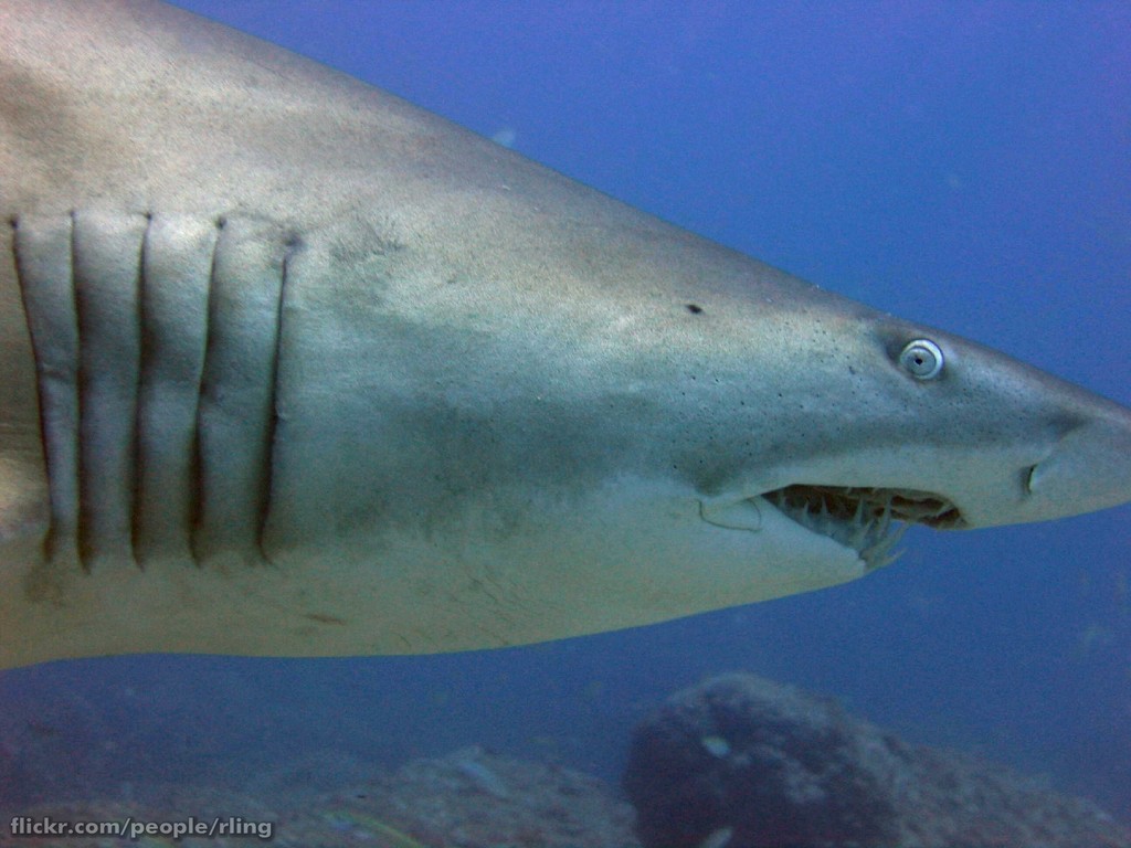
I thought of shark gills as i want my creature to have similar openings on its sides.

"Jellyfish"

Although not very apparent in my refined sketch, i want my creature to have jellyfish-like tendrils protruding from its base, and possibly from other parts.

"Fish Eye"


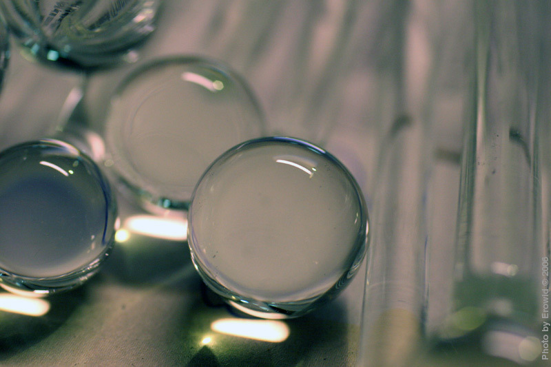
I looked up these images to help me see the way fish eyes appear. This turned out to be completely unlike what i wanted to find and unfortunately after a long time spent searching i wasnt able to find anything like i wanted, so instead i looked to marbles and water bubbles.


"Amphibian -> Slimy Skin -> Fish"


My original thought for my creatures skin compared it to that of a tree frog, but on closer inspection it became apparent that these frogs do not have perferctly smooth skin causing me to change the term to "slimy skin", which led me to the realisation that a fish's skin (out of water) would be perfect:


I would like to capture the slimy, shiny appearance of the skin of these fish in my image, i may go so far as adding the scaly undertones as well but this may prove to be beyond me.

"Muscle Structure"


I needed some reference images on muscle structure so that i could properly portray the shape and tone of my creatures arms and shoulder area as these are based heavily on human anatomy.

I found that making this list actually led me to improving my refined image, making it more focused and detailed. I believe it improved the overall result as i actually went back and changed some things on my refined drawing while i made it.

I thought i would end this post by adding another image of Marks that stuck with me while looking through his work and as you can tell had an influence on my refined image:

http://www.markbehm.com/images/dg_alien1.jpg